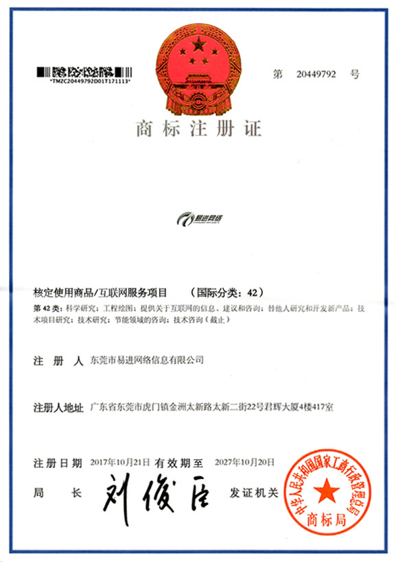
The entire logo design is developed around the letter E. The first logo uses the word "Yi" as the design element, transforming the word "ri" on Yi into an E to reflect the industry characteristics of network technology, and the lower part looks like a streamer, reflecting ease Naturally, progress.
⑴. The logo uses E as a design element. E reflects the industry characteristics of network technology, Tai Chi, all-encompassing, network world, rich network elements, and a variety of network technology solutions.
⑵. Take Easyjoin letter E and arrow as design elements. EASY; easy and simple. JOIN, to join, means to enter, the same as the name of the company, and the pronunciation is similar to Yijin's Chinese pronunciation. It is very suitable for us to have an English. At the same time, the first letter E is synonymous with the network, which reflects the network technology. The industry characteristics of network technology, the blue three-dimensional E embodies the technology-based business philosophy, and the upward arrow reflects the meaning of continuous improvement and continuous development. The logo gives people a quick and smooth feeling and reflects fast service.
Blue symbol: technology, harmony, vitality, vitality, hard work


 簡體中文
簡體中文

 簡體中文
簡體中文

